
Canna
Content
Brand Identity
CannaContent is a digital marketing agency focused on helping cannabis brands grow through strategic storytelling and high-performing content. The goal was to create an identity that feels sharp, expressive, and culturally fluent, moving beyond the expected aesthetics of the cannabis industry. The challenge was to create an identity that reflects both creative direction and measurable impact
The brand system centers around a monochromatic palette and collage-driven visual language, creating a bold, flexible identity designed for digital-first environments.
I developed the full identity system, including logo, color palette, typography, website, visual language, and brand voice, along with applications across web and marketing materials.

Strategy
CannaContent positions itself as a content-first growth partner, helping cannabis brands cut through noise and scale with intention. Rather than presenting as a traditional agency, the brand speaks directly to founders and teams who need better content, clearer strategy, and stronger results, framing its services around tangible outcomes rather than abstract offerings.
-
The brand is grounded in the belief that content should perform, not just look good, and that strategy should be backed by insight rather than guesswork. Every creative decision is made in service of growth, with an emphasis on clarity over complexity to ensure messaging is both effective and accessible.
-
CannaContent is designed for cannabis brands ready to scale, particularly founders investing in marketing infrastructure and teams seeking a strategic creative partner who can deliver both direction and execution.

Logo System
The logo system is designed to be bold, immediate, and highly functional across digital platforms.
-
A clean, modern wordmark communicates clarity and confidence, establishing trust without relying on unnecessary embellishment or trend-driven styling. The slash angle through the middle is indicative of traditional content and design markups.
-
A distinct symbol accompanies the wordmark, serving as a flexible, recognizable shorthand for the brand. Its form reinterprets a cannabis leaf through a geometric lens. Rather than leaning into literal or overly detailed representations, the form is simplified into structured shapes, creating a mark that feels modern, intentional, and highly adaptable. This approach allows the symbol to reference cannabis clearly while aligning with the brand’s overall visual identity.
Color Palette
The palette is intentionally monochromatic, reinforcing clarity and impact across all applications. This approach maintains the discipline and cohesion of a monochromatic system while introducing more visual richness and flexibility. Teal tones form the foundation of the system, allowing for depth, variation, and hierarchy within a single color family. Black and white are used as secondary supporting colors, providing contrast, structure, and clarity across layouts.
The teal spectrum evokes clarity, growth, and forward momentum, while the restrained use of black and white ensures the overall identity remains sharp, modern, and highly legible.
Fonts
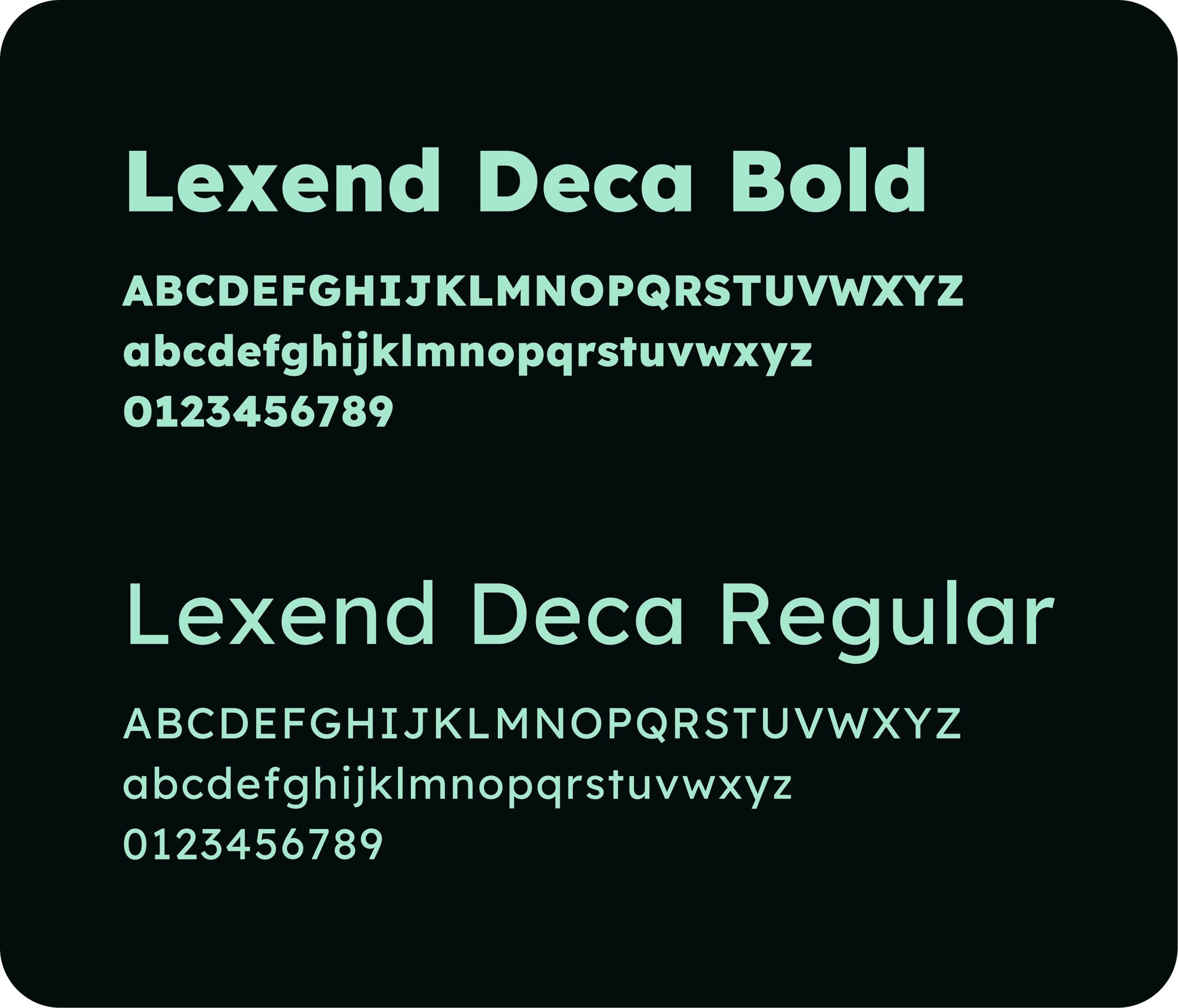
A modern sans-serif typeface is used throughout, providing strong readability, clean structure, and reliable performance across digital platforms. It is applied with a focus on bold, direct headlines paired with minimal, highly legible body copy, creating a clear and intuitive hierarchy. Rather than a decoration, the Lexend Deca system functions as a primary communication tool, delivering information efficiently while reinforcing the brand’s sharp, confident tone.

Visual Language: Collage System
The collage system is a defining feature of the brand. It brings energy and storytelling into an otherwise minimal framework. The style draws from both surrealism and assemblage techniques, using layered compositions to create bold, conceptual visuals. These combinations feel expressive and slightly disruptive, helping the brand stand apart. The system reflects how modern content is made and consumed: fast, dynamic, and visually layered. It adds depth and movement while avoiding predictable agency aesthetics. Used across social content, the website, and marketing campaigns, the collage system keeps the brand consistent while staying flexible, imaginative, and culturally relevant.










Website Design
The website is designed as a conversion-focused, content-forward experience that reflects both the strategic and creative sides of the brand. The primary objective is to communicate value quickly, showcase expertise clearly, and guide users toward meaningful action without friction.
-
High-contrast layouts, strong typographic hierarchy, and collage-driven visuals work together to create a clear, engaging experience, supported by direct calls to action that reinforce the brand’s focus on results.
-
The overall experience feels fast, focused, and intentional, mirroring the agency’s approach to both strategy and execution.
Collateral
The collateral system expands the brand into tactile, interactive formats, reinforcing its focus on content, creativity, and audience engagement. These pieces are designed to go beyond traditional marketing materials, offering experiences that invite participation and reflect the brand’s personality.
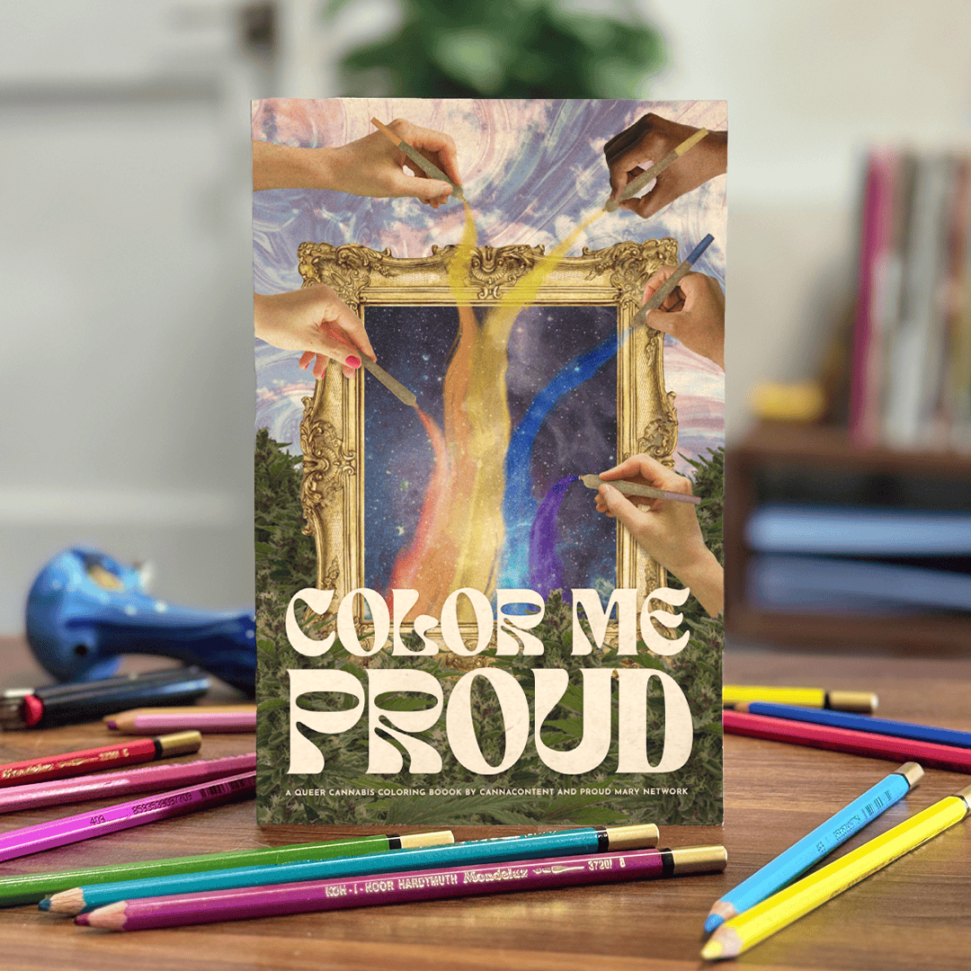
High IQ Vol. 1 & 2 are exclusive cannabis-themed puzzle books that combine problem-solving with sharp visual design, creating an unexpected and engaging format within the industry. Color Me Proud, a Pride-themed coloring book, celebrates inclusivity and self-expression through illustration and interaction. Together, these projects position CannaContent as both a creative and cultural contributor, not just a service provider.

Merch
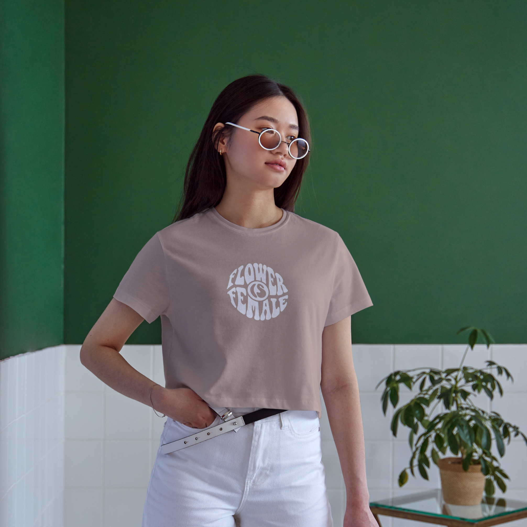
The merchandise system extends the brand beyond digital and into culture, using product as a platform for storytelling and advocacy. It centers women and non-binary voices in cannabis, drawing from the plant’s long history as a source of healing and resilience, and aims to build community while challenging stigma around cannabis usage
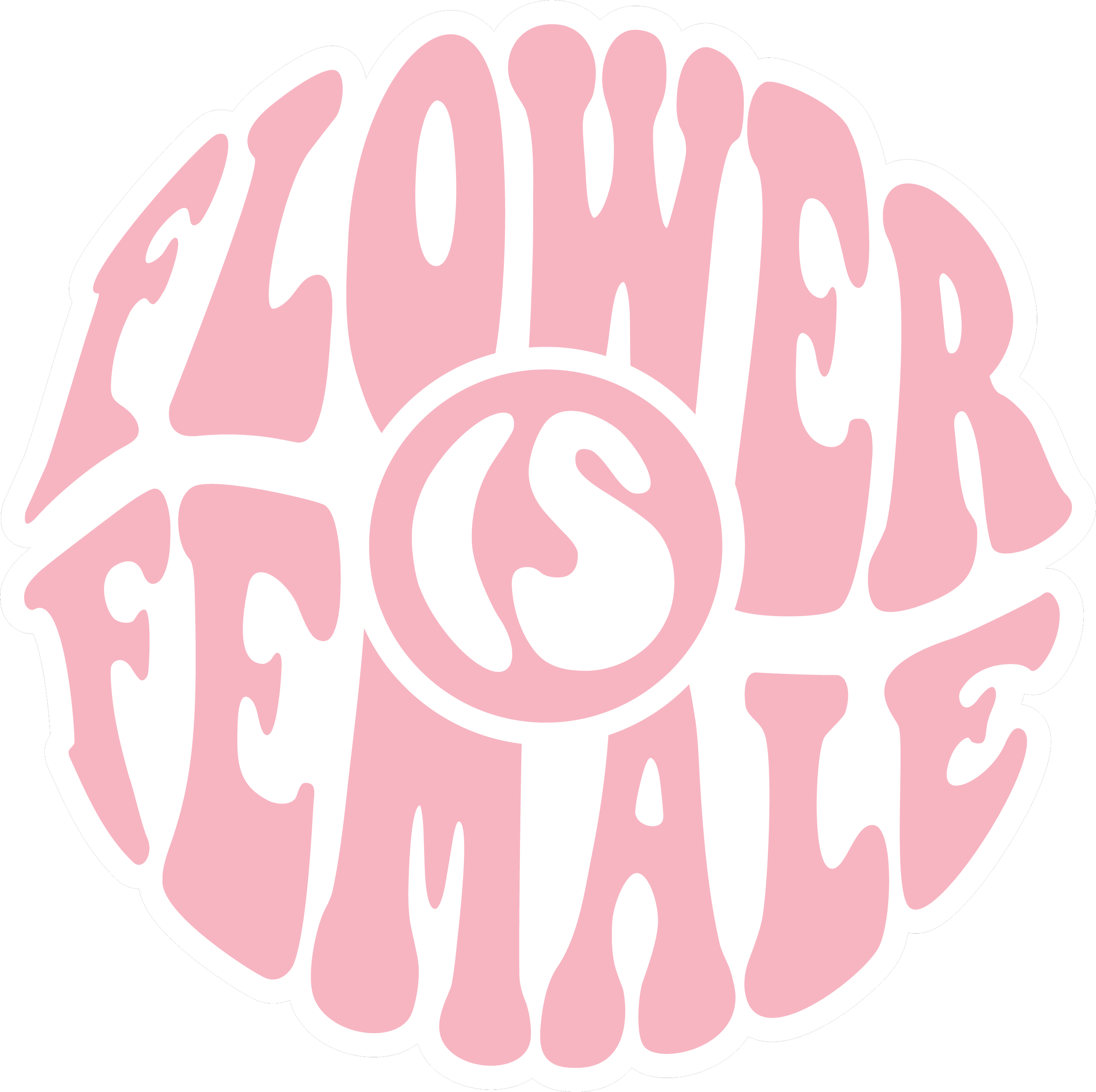
A key merch release is the Flower Is Female line, inspired by cannabis as a nurturing, healing force and the strength of the people it supports. The collection highlights women in an industry where they are often underrepresented, pairing bold messaging with fluid shapes. Proceeds from each sale are donated to the This Is Jane Project – a nonprofit dedicated to empowering women and non-binary individuals healing from trauma through cannabis, while working to destigmatize these conversations and expand access to care.



The CannaContent identity establishes a differentiated presence within a competitive market, giving the agency a strong foundation for growth. The system creates a bold and recognizable visual identity that remains flexible across platforms and client work, while effectively communicating both strategic expertise and creative capability.