
Rosie’s
Botanicals
Brand Identity
Rosie's Botanicals is a cannabis dispensary in Highland, NY. It is LGBTQ+ owned, wellness-driven, and named after Rosie Rivera, a woman who believed cannabis could bring peace to people from all walks of life. The brand exists to honor that legacy by making cannabis feel exactly like what it always was at its best: communal, human, and unhurried.
The visual identity draws from the golden age of underground print culture. The hand-set type of Rolling Stone's early issues, the earthy palette of Whole Earth Catalog spreads, and the warmth of a Grateful Dead poster. Not 70s as a costume, but 70s as a set of values: slow down, tune in, take care of each other.
The whole system (strategy, voice, packaging, digital, signage) is built around one line:
"Flower to the People."
Brand Strategy
Most cannabis brands in 2024 either go clinical (lab coats, lab lighting, lab language) or hype-forward (streetwear drops, hype windows, scarcity). Rosie's rejects both with a nostalgia-forward aesthetic. The reference point is the food co-op, the record store with a listening station, the neighborhood spot where the staff actually knows what they're talking about and doesn't make you feel dumb for asking.
The 70s counterculture wasn't anti-establishment for its own sake. It was pro-community. That's the energy here. Warm. Quietly confident. Zero gatekeeping.
-
Accessible, not intimidating
Natural, not clinical
Community-driven, not transactional
Expressive, with intention
-
Logo System
The Rosie's wordmark is drawn from the tradition of 70s hand-lettered signage. The kind you'd find painted on a Woodstock-era natural foods store or silk-screened on a concert handbill. Soft, rounded terminals. Curves that feel like they were drawn by hand, not pulled from a type menu. Tight enough to read clean on a jar label; expressive enough to hold a wall.
Secondary marks extend the system across packaging, social, merch, and in-store without diluting the primary. Each lockup is built to work as a standalone or part of the larger family.
The design intent is to feel like something that's been around long enough to earn your trust, without pretending to be vintage. Retro warmth, modern restraint.
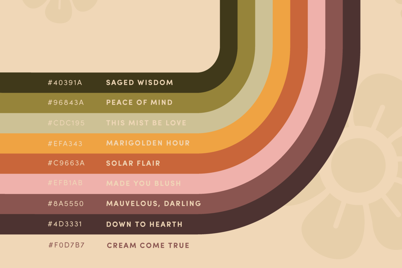
Color Palette
The palette is pulled from the physical world of 70s print: sun-faded field guides, avocado-green kitchens, the warm amber of a lava lamp mid-cycle, the cream of a worn paperback spine.
Core tones:
Muted sage and eucalyptus greens: the color of dried herbs, not pharmacy signage
Terracotta and clay: the Hudson Valley in October
Warm cream and parchment: analog, tactile, unhurried
Occasional saffron or rust as an accent: a moment of personality without shouting
The palette wears in while standing out. It feels like something you'd already have in your home, which is exactly the point.
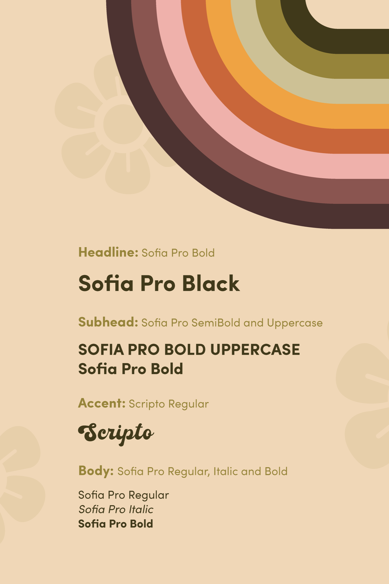
Fonts
Primary: Sofia Pro
Clean geometric letterforms that give the system its modern backbone. Readable at any size, calm in long-form copy. It's the straightforward friend who gives you good information without editorializing.
Accent: Scripto
Used sparingly and purposefully to mark the moments that matter, Scripto echoes the logo's hand-drawn quality and reinforces the sense that a real person made this. It appears in taglines and packaging.
Together, the tension between structure and handwriting is the same tension the era had: rigorous ideas, humanly expressed.
Icons
A custom icon system was developed for the website to help simplify product navigation and make browsing feel more intuitive for both new and experienced consumers. Each category icon was designed with soft, rounded forms that align with the overall visual identity while creating a clear distinction between product types.
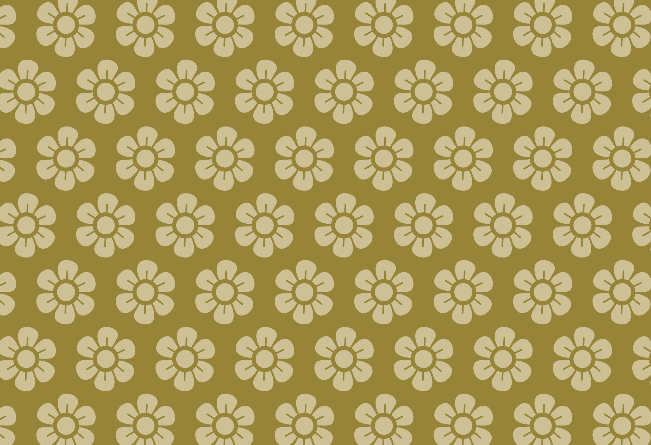
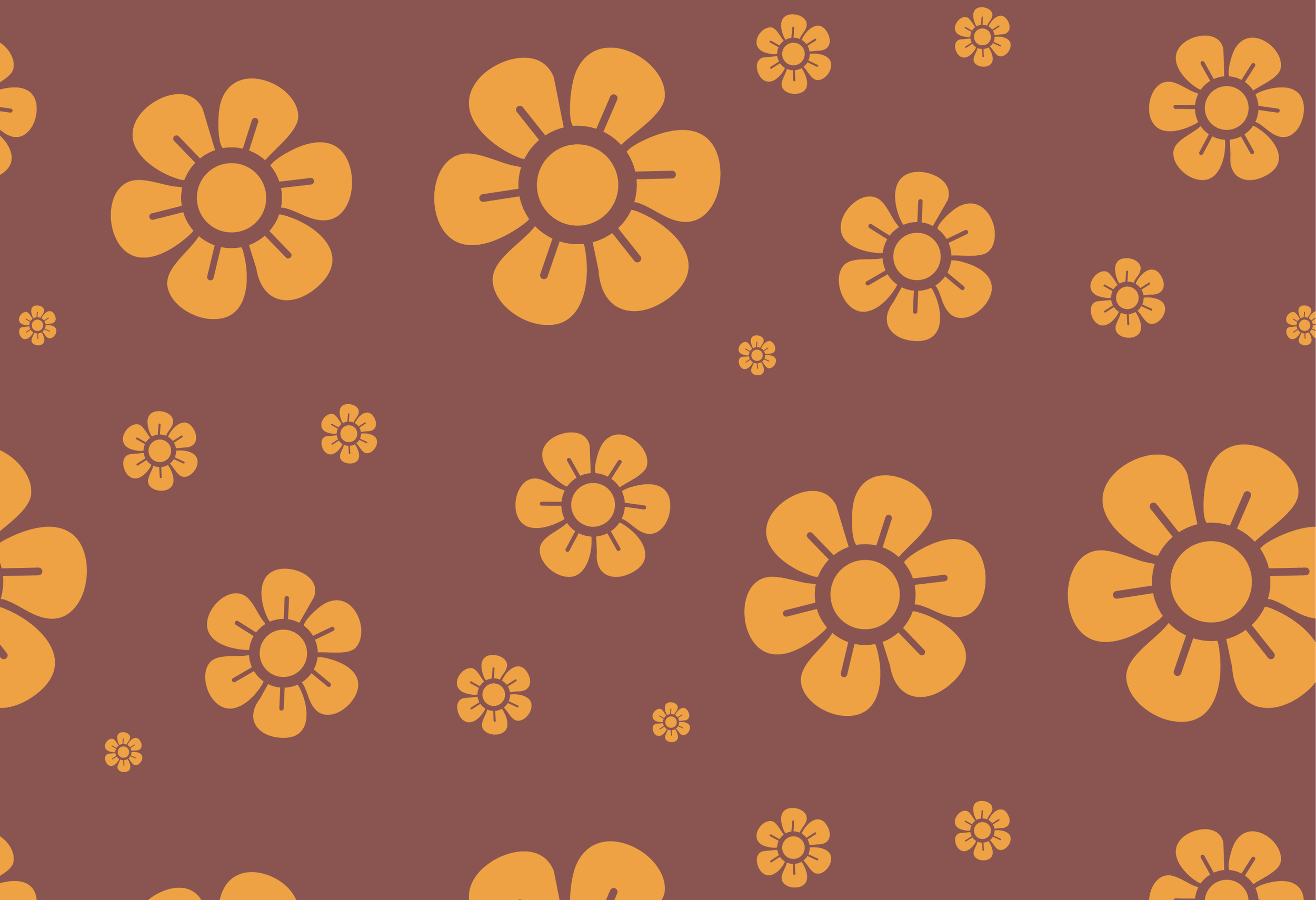
Patterns
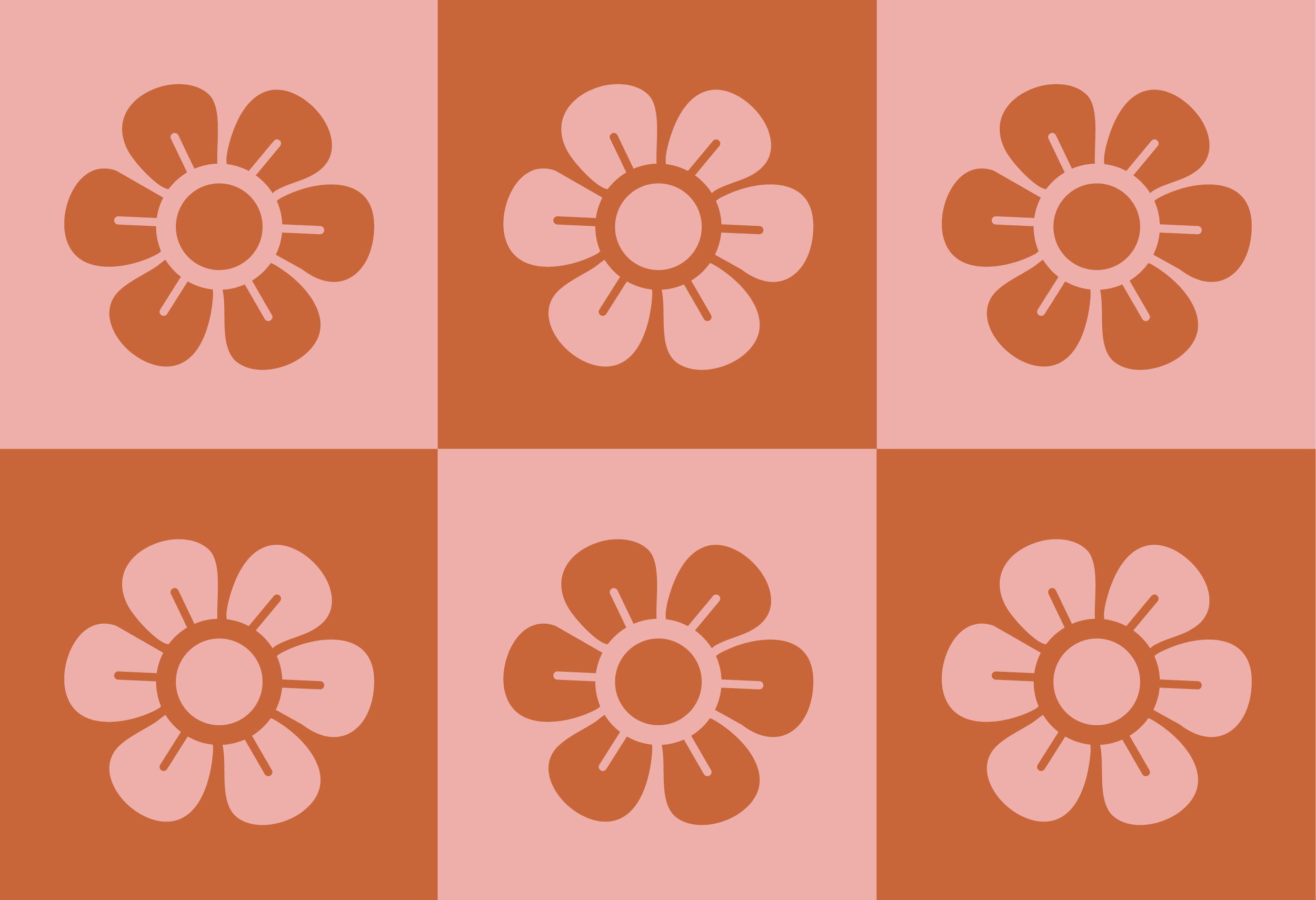
The pattern system draws from retro floral textiles, vintage wallpaper prints, and checkerboard motifs commonly found throughout 70s interiors and fashion. Repeating daisy illustrations, earthy color palettes, and rounded geometric layouts create a sense of warmth and familiarity throughout the brand. Used across packaging, web, collateral, and environmental applications, the mix of dense florals, oversized blooms, and modular grids helps create visual rhythm, flexibility, and stronger brand recognition across the full identity system.


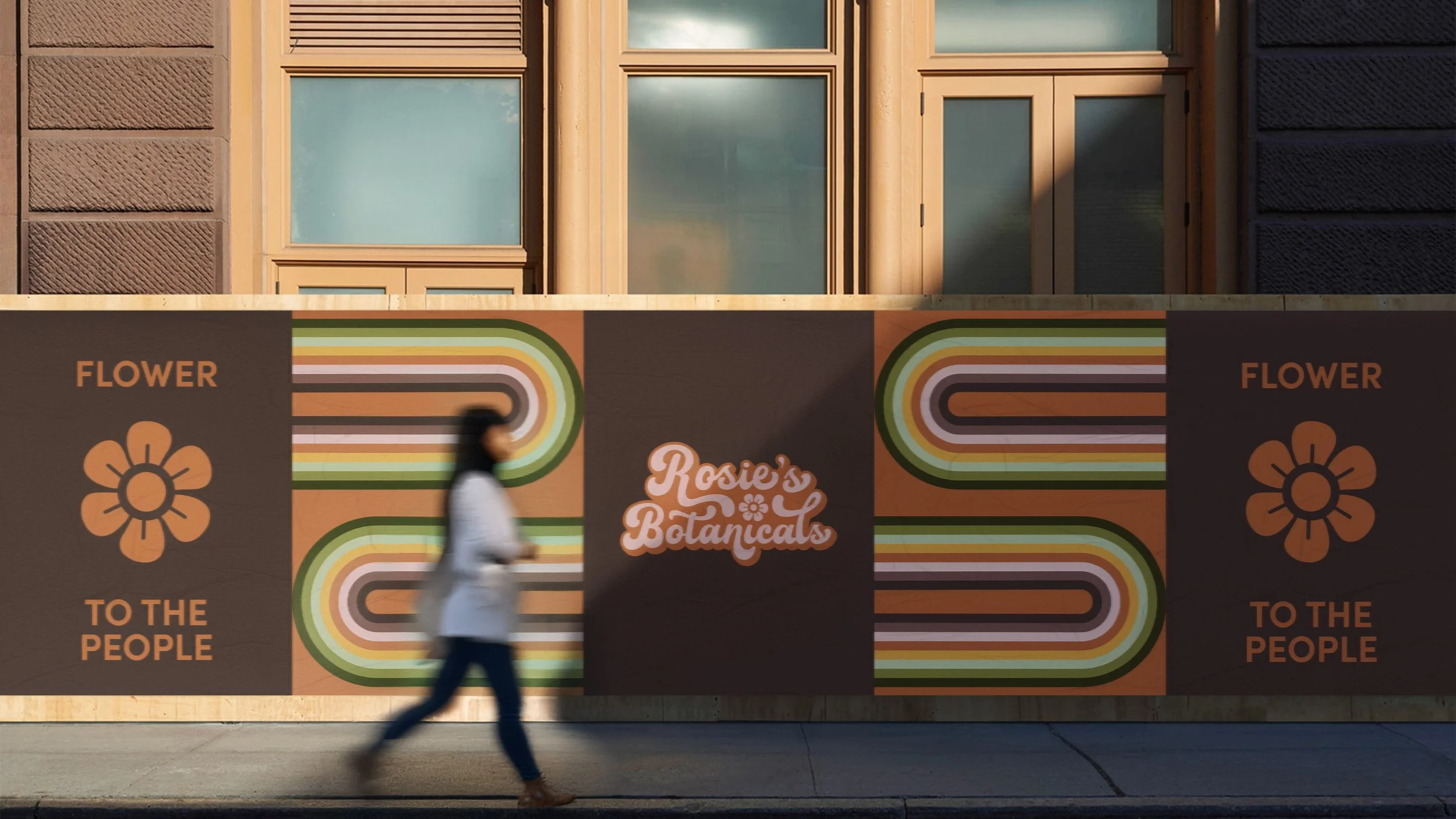
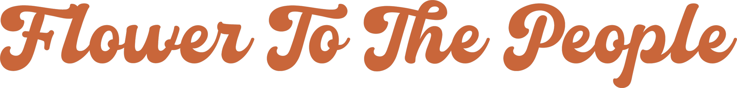
Tagline: "Flower to the People"
This line is the brand's north star, a direct riff on "Power to the People" that reframes cannabis as something that was always meant to be shared. It expresses the commitment to uplifting marginalized communities through healing herbs.
It roots the brand in a specific cultural moment and mindset without leaning on nostalgia for its own sake, positioning cannabis as communal and accessible rather than exclusive or aspirational, and ultimately giving the brand a clear, authentic point of view it can confidently stand behind.
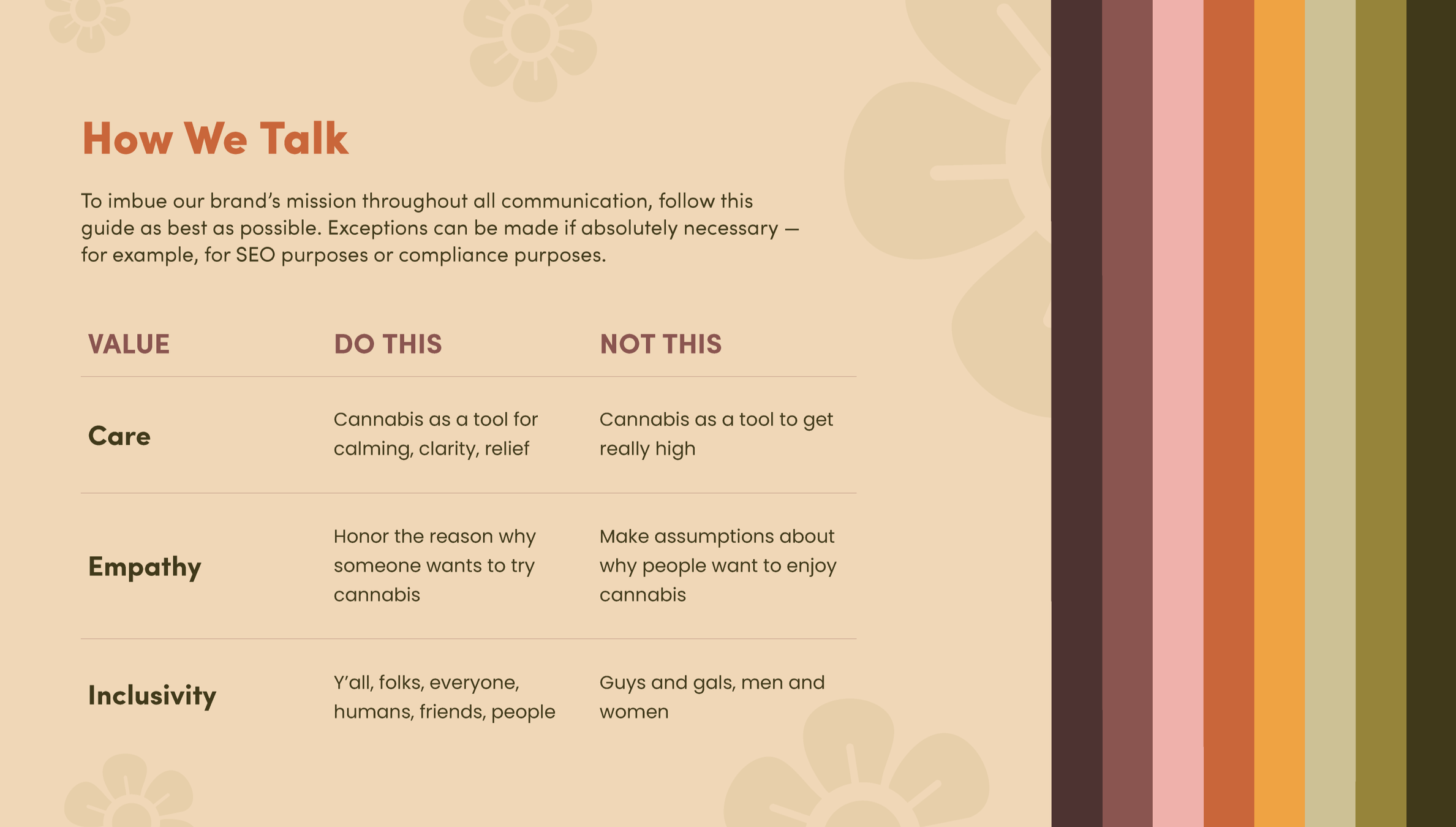
Brand Voice
Rosie Rivera believed cannabis could bring people together. The brand voice carries that forward, not as a mission statement, but as a way of talking.
The voice is consistent whether it's a product description, a social caption, or a sign above the door. It never sounds like a corporation that trained a robot to sound human.
-
arm. Conversational. Lightly playful. The friend who knows a lot but never holds it against you.
-
Clear language, no jargon, occasional wit. The copy treats you like an adult who doesn't already know everything, not a customer.
Good plants. Good people. No gatekeeping. vs. Premium cannabis products for discerning consumers.
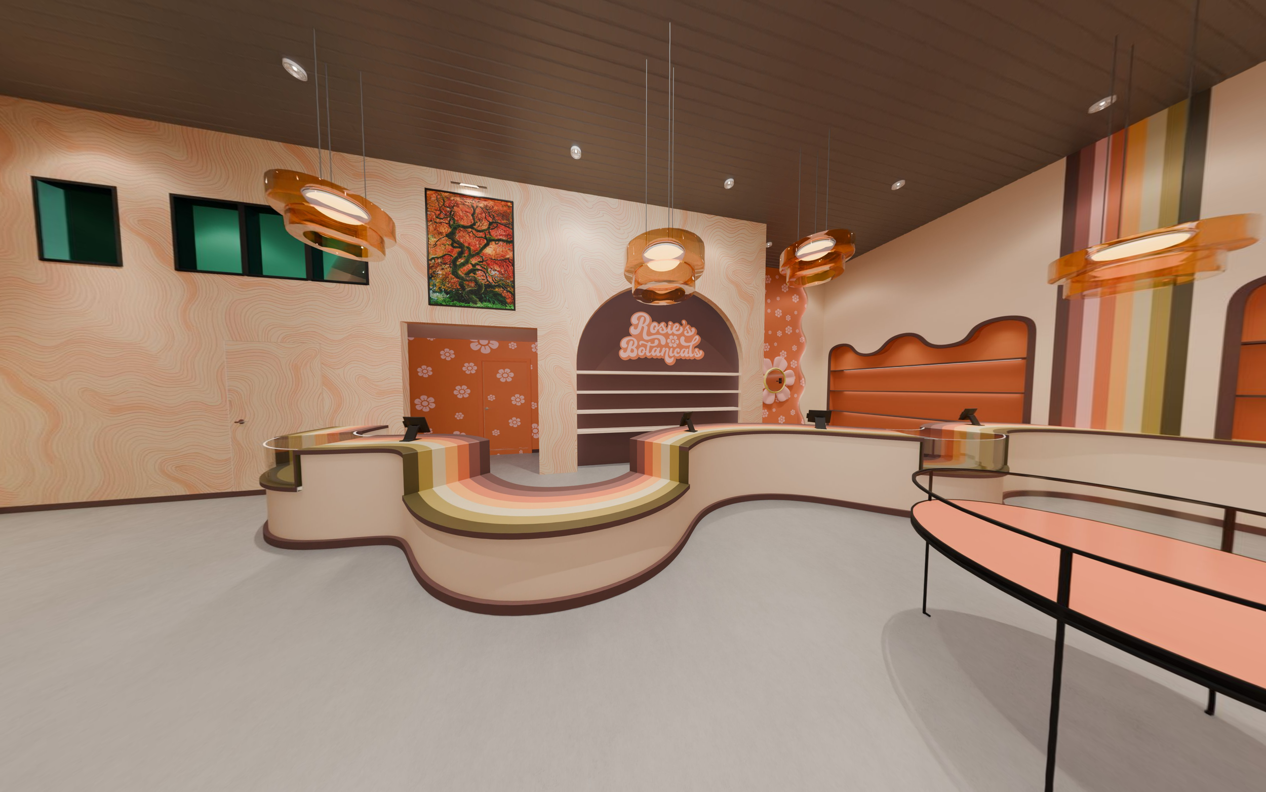
Website Design
The site translates the print-culture references into a digital experience without forcing a retro skin on modern UX. Think: 70s Supergraphics systems with striped geometric patterns that evoke a sense of movement. The goal was a site that feels like an invitation rather than a menu
Color-blocked sections that feel like broadsheet panels
Soft, organic shapes that break the grid without breaking the layout
Copy that actually tells you what things are, and why
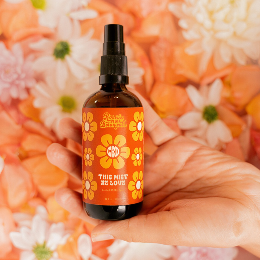
Product Design
This Mist Be Love - CBD Spray
Rosie's first foray into cannabis-infused self-care, This Mist Be Love is a CBD face mist that treats a morning routine like a small act of devotion. The name is earnest, a little romantic, and completely in step with a brand that believes plant medicine and daily ritual belong together.
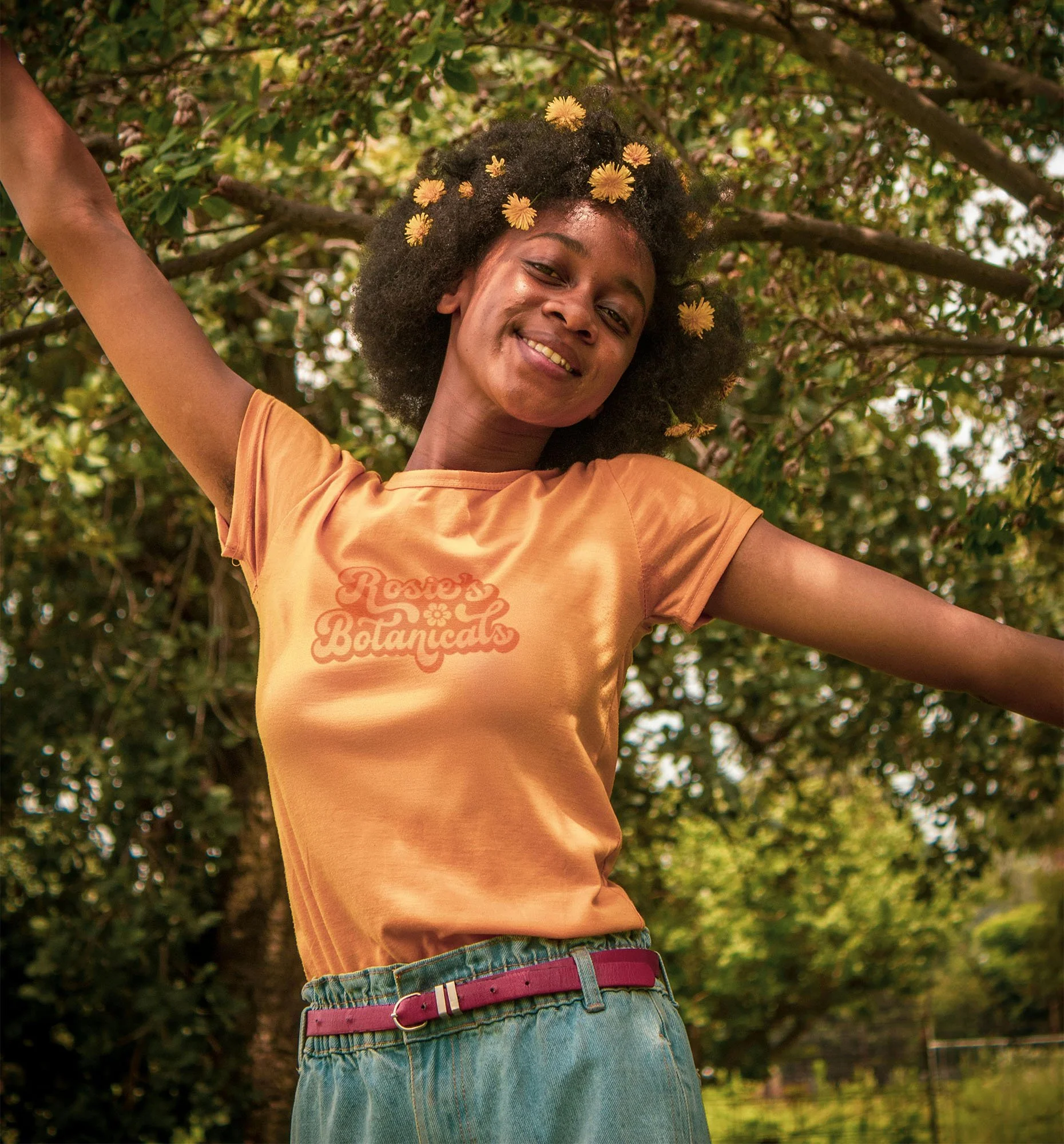
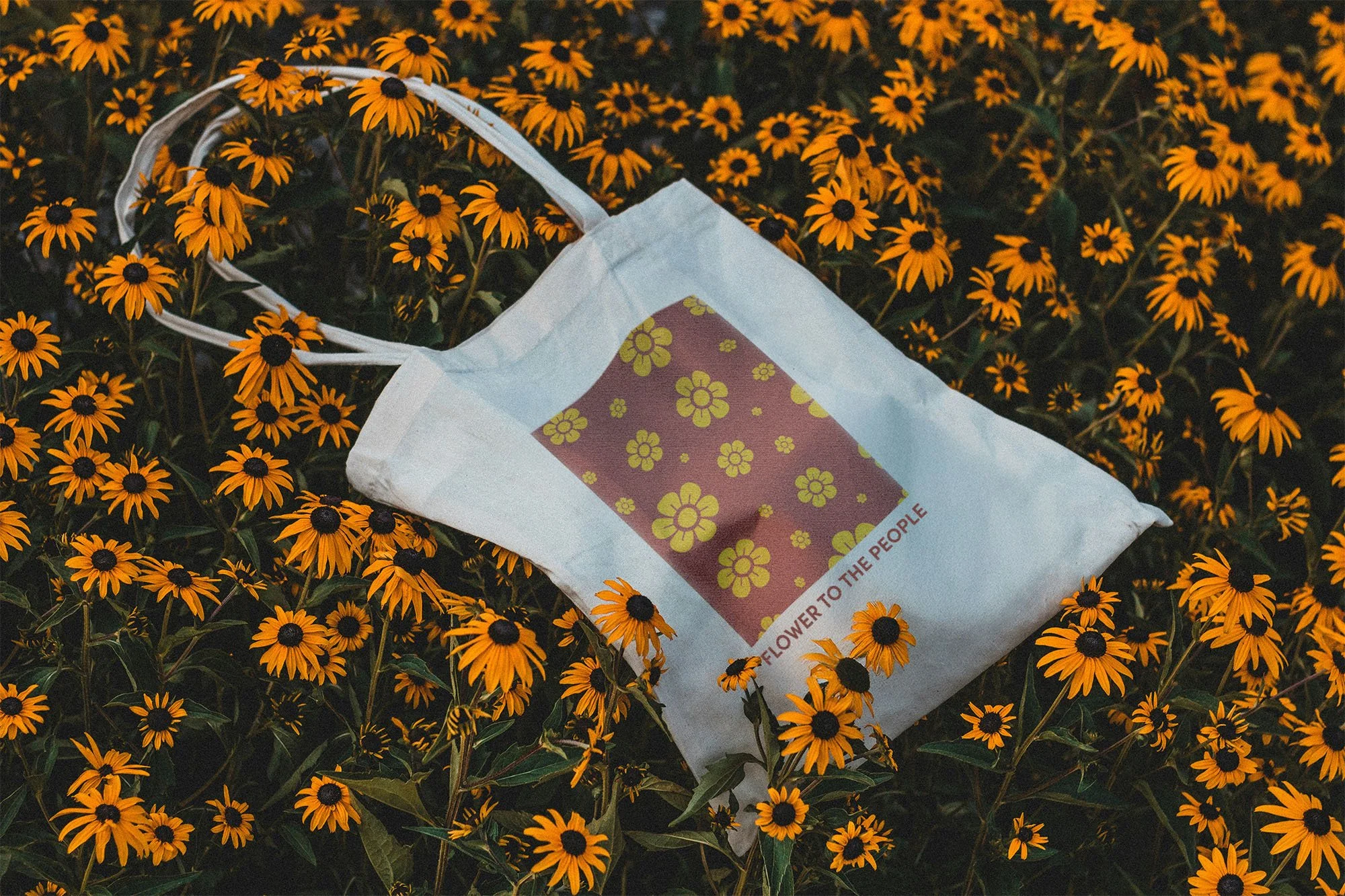
Branded Merch
The Rosie's Botanicals merch line extends the brand into the everyday objects that already live inside a cannabis ritual. Apparel, accessories, lighters, rolling trays: nothing here feels like an afterthought or a logo slapped on a tote bag.
Each piece pulls from the same visual vocabulary as the core identity. The daisy motif, the rounded wordmark, the warm terracotta and cream palette. Apparel leans into 70s sportswear references: pigment-dyed tees, relaxed cuts, the kind of stuff that looks better after a few washes. Lighters and rolling trays treat utility as an opportunity, graphic enough to leave out on a coffee table without apology.

Rosie's Botanicals enters a crowded, often copy/paste cannabis market and does something most brands don't: it feels like a place, not a product line. The identity holds its reference points without being consumed by them. It honors Rosie Rivera's legacy not through nostalgia, but through the same values she carried: openness, community, and care.