
Rebrands
These projects focus on evolving existing brands into more refined, cohesive, and effective identity systems. Each rebrand balances familiarity with transformation, preserving the original brand recognition while improving usability, visual consistency, and audience connection. The work spans identity refreshes, packaging redesigns, visual system updates, and supporting launch materials designed to help brands grow with greater clarity and impact.
Jersey Strong
Cannabis
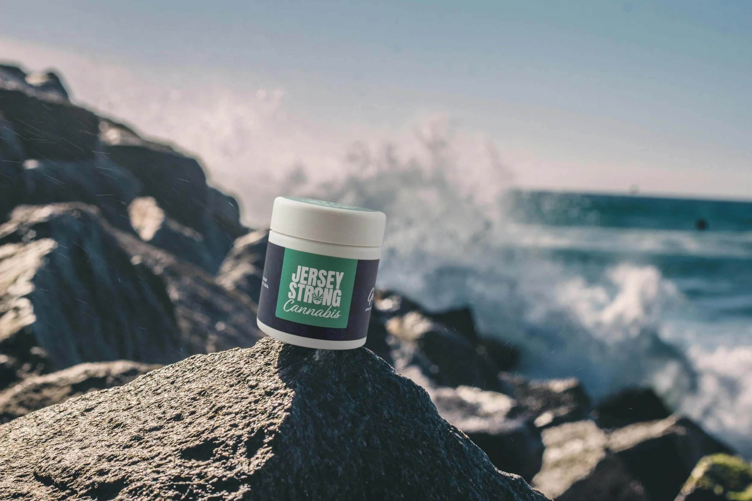
Jersey Strong is a cannabis flower product line designed to connect with the modern New Jersey consumer, particularly moms seeking a more approachable and lifestyle-oriented cannabis experience. The project combined a product launch and rebrand, evolving the existing identity into a system that feels more refined, trustworthy, and consumer-friendly while maintaining the recognizable spirit of the original brand.
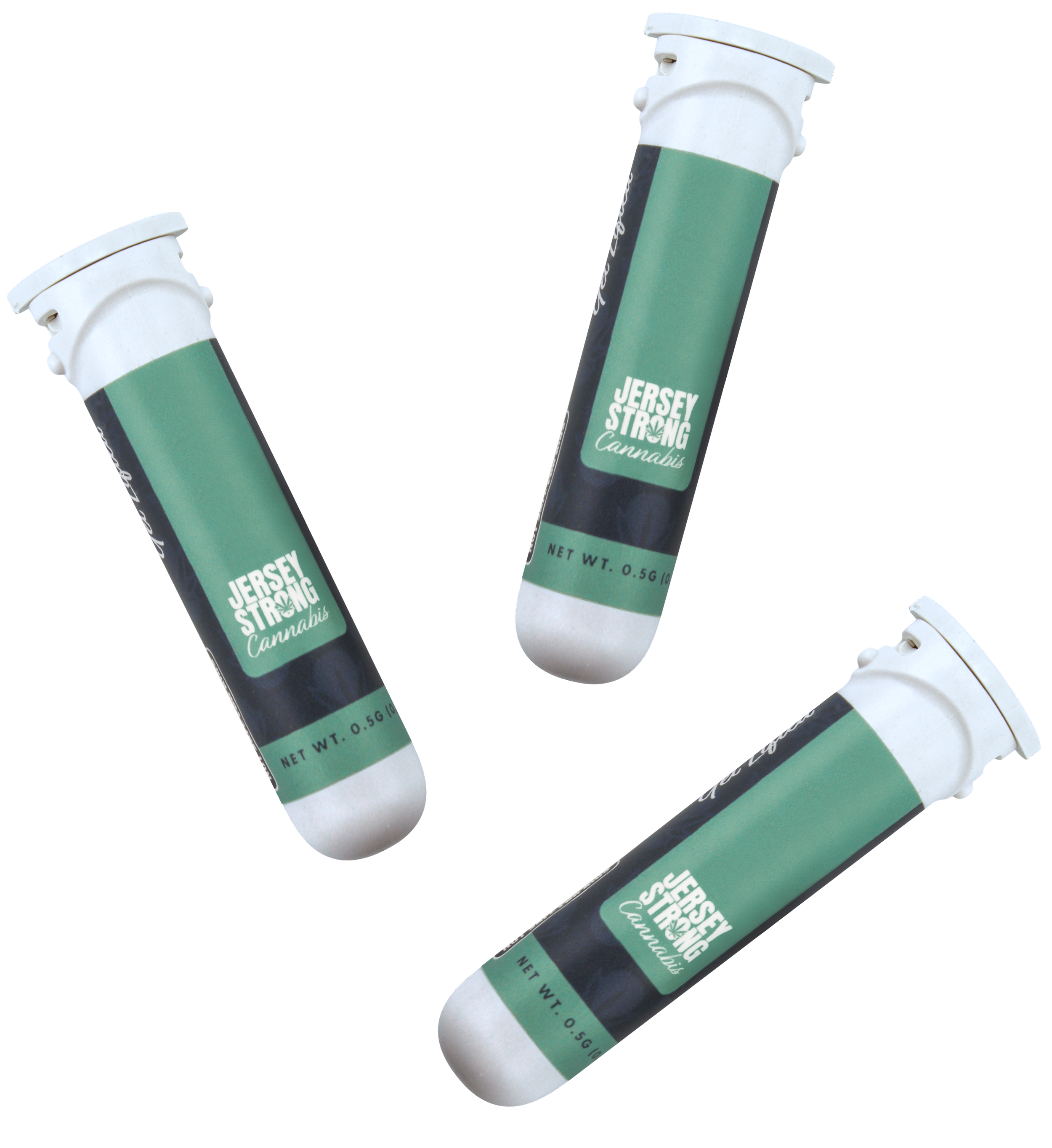
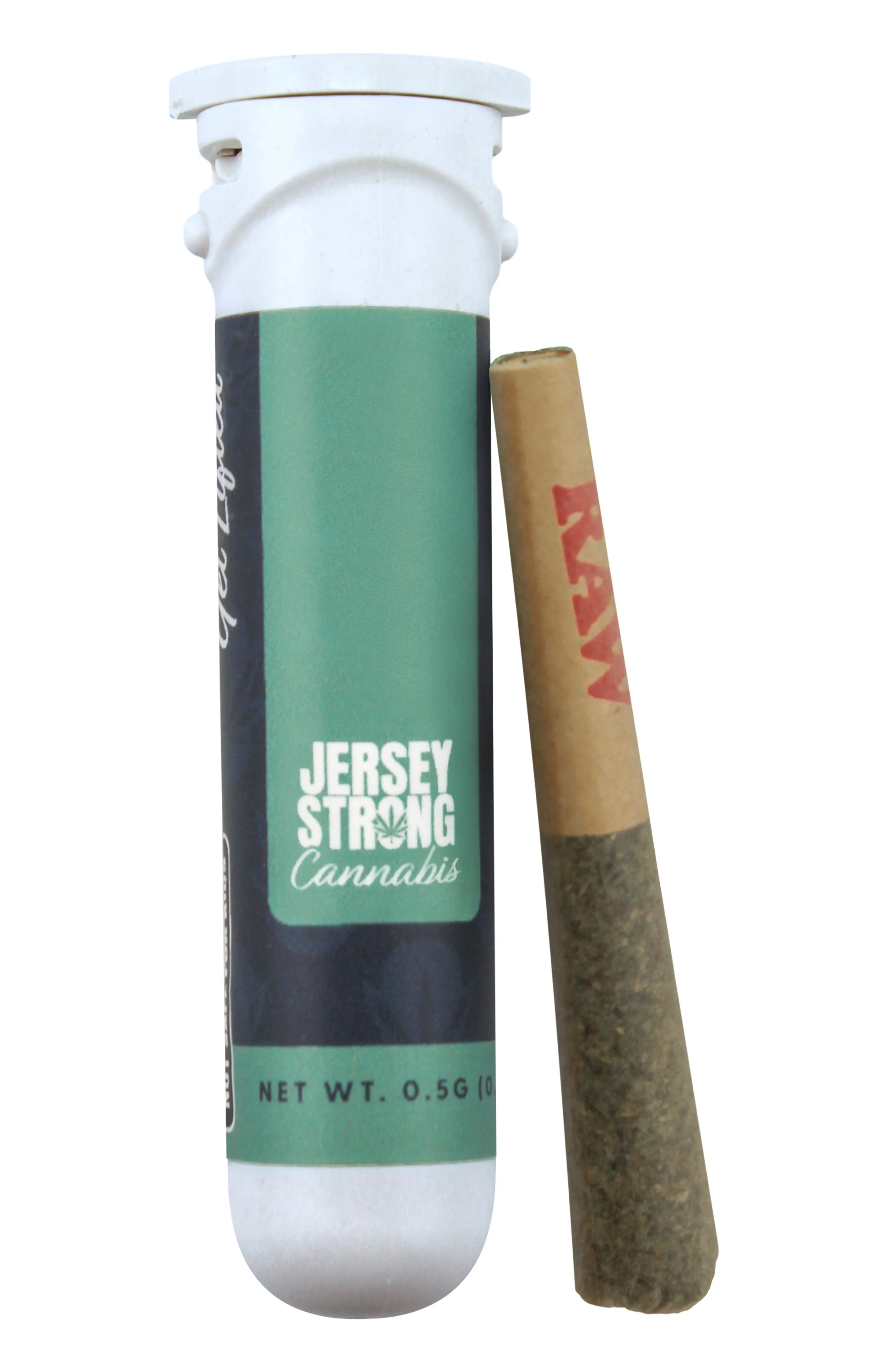
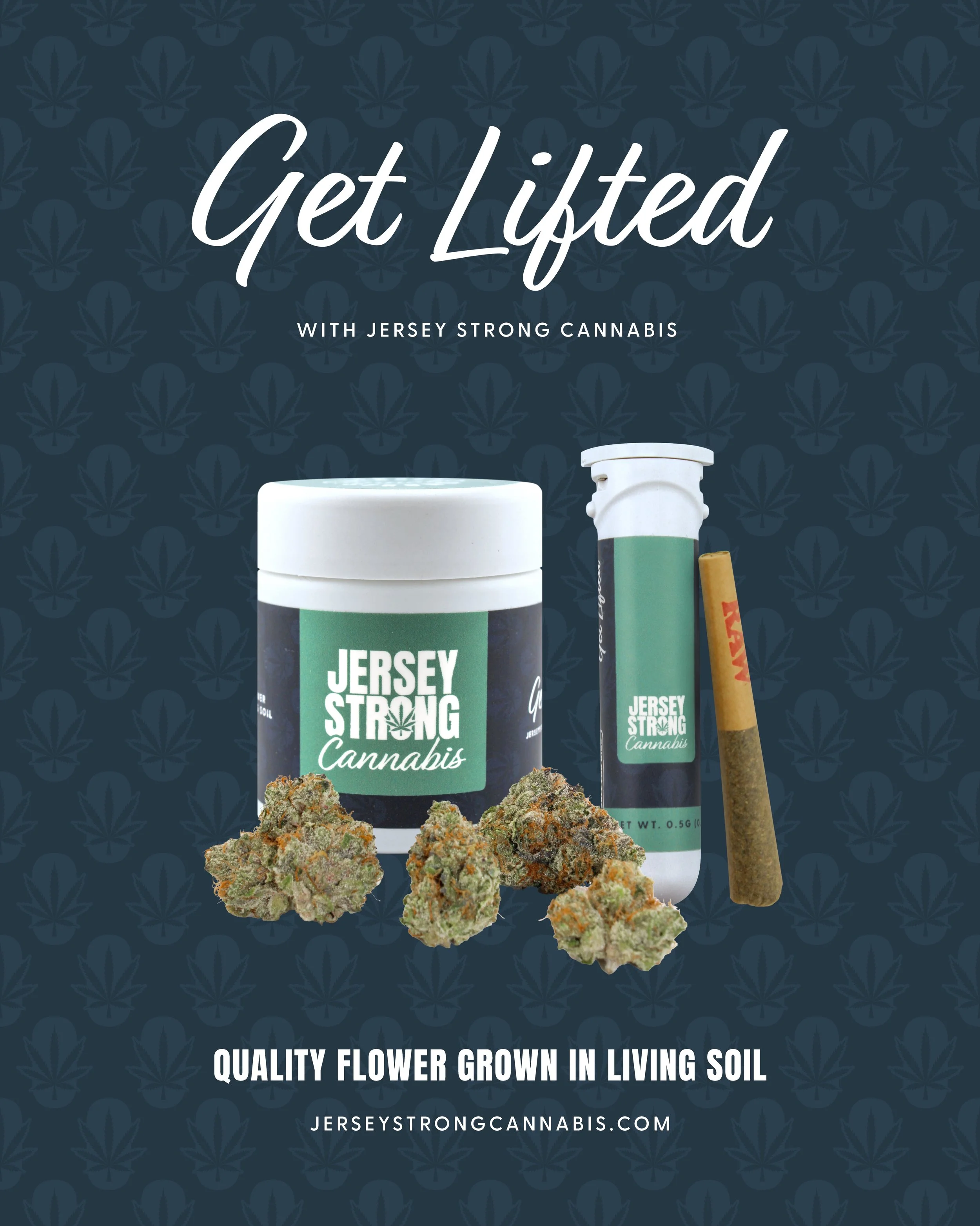
Using the updated identity system, I developed packaging for cannabis flower and prerolls along with supporting brand elements across launch and marketing applications. The work focused on balancing bold shelf presence with a warmer, more accessible tone, creating a product experience that feels familiar, elevated, and rooted in everyday wellness.
Brand Strategy
Jersey Strong positions cannabis as part of a balanced, everyday lifestyle shaped by local culture and familiarity. The rebrand moved away from aesthetics that felt overly aggressive or niche and instead focused on creating a brand that feels welcoming, polished, and easy to connect with.
The system was built around accessibility, clarity, and emotional connection. Every element was designed to make the brand feel approachable while still maintaining strong retail visibility and recognizable shelf presence.
The brand was developed for adult cannabis consumers in New Jersey, with a particular focus on moms and lifestyle-oriented consumers looking for products that feel dependable, elevated, and easy to incorporate into daily routines.
(Old Logo)
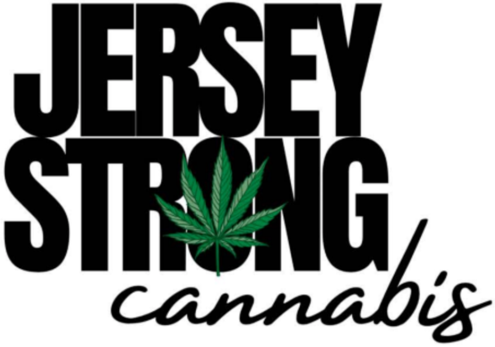
Logo
The logo redesign focused on improving usability and likability while preserving the overall vibe of the original identity. The system was designed to feel bold enough to stand out on the shelf while maintaining a softer, lifestyle-oriented tone that better reflects the target audience and overall brand direction.
-
The updated logo keeps the recognizable energy of the existing brand while introducing cleaner forms, improved balance, and stronger flexibility across applications. The result feels more polished and approachable without losing familiarity.
-
In addition to the refreshed logo, I developed a supporting visual system that included custom iconography, branded pattern work, and the “O-leaf” symbol pulled directly from the wordmark. The symbol acts as a recognizable shorthand for the brand across packaging, promotional materials, and launch assets, helping create a more cohesive and flexible identity system while reinforcing brand recognition across touchpoints.
(Full Logo)
(Symbol)
Color Palette & Visual Language
The visual language combines bold branding with softer lifestyle-driven elements to create a system that feels approachable, cohesive, and easy to navigate. Supporting graphics, iconography, and patterns add warmth and personality throughout the identity, while promotional imagery inspired by the New Jersey Turnpike and shore travel culture helps ground the brand in a strong sense of place and familiarity. The overall system was designed to stand out in retail environments while still feeling refined, welcoming, and connected to everyday lifestyle experiences.


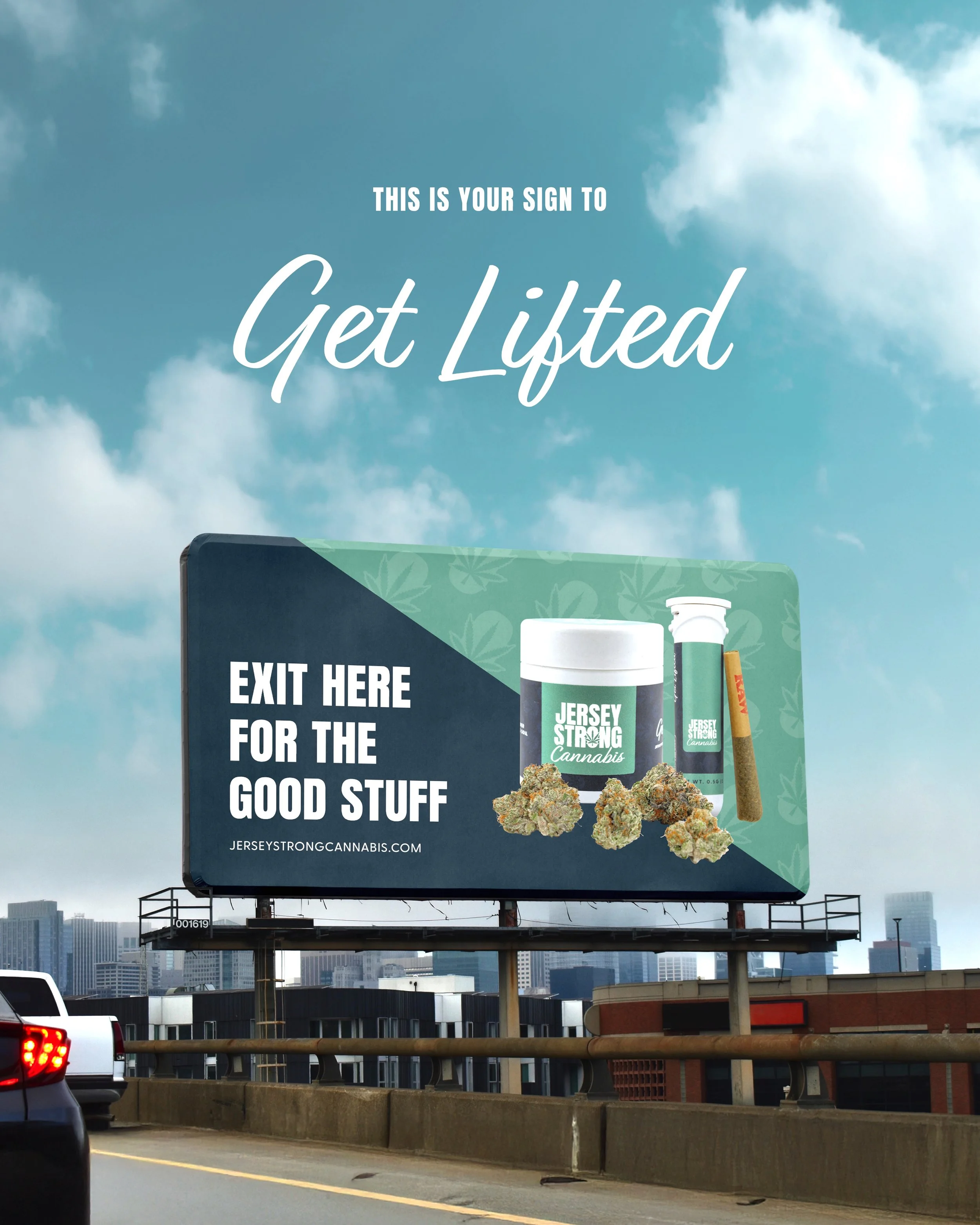
Tagline
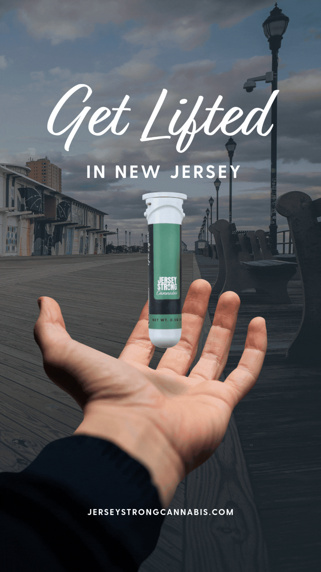
I created the tagline “Get Lifted” as part of the rebrand to reinforce the brand’s approachable, feel-good positioning. The phrase references both cannabis culture and the experience of heading “down the shore,” tying directly into the brand’s New Jersey roots and travel-inspired campaign imagery.

Product Design
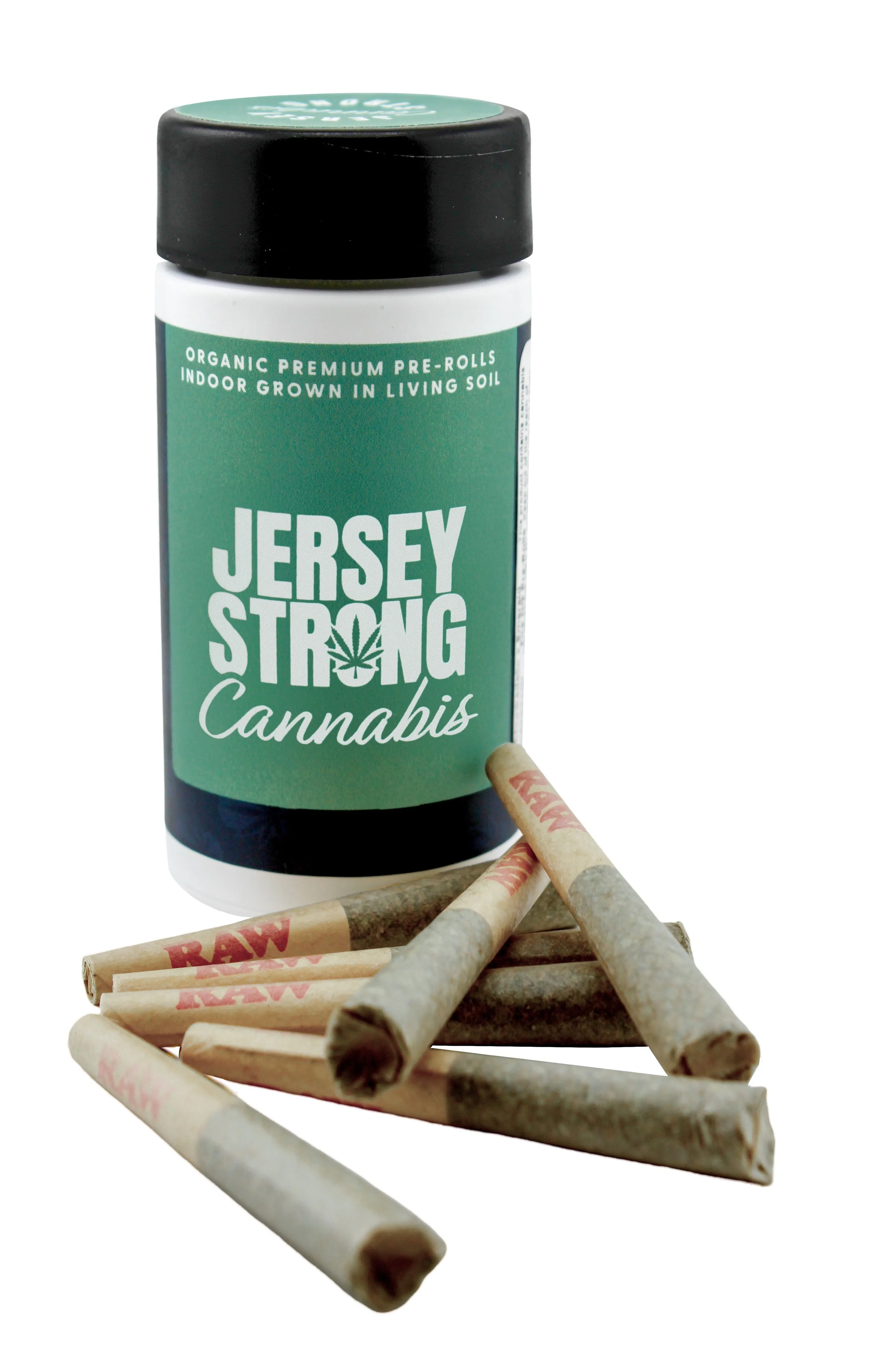
The product launch included packaging design for both cannabis flower and prerolls, translating the updated identity into a physical retail experience. The packaging focuses on clarity, usability, and shelf recognition while maintaining a more elevated and approachable aesthetic.
Each product was designed to feel intuitive and easy to navigate, using clear hierarchy and cohesive branding to create consistency across formats. The result is a packaging system that feels polished, scalable, and aligned with the needs of modern cannabis consumers


Launch Assets
To support the rollout, I created a range of launch assets across digital and branded touchpoints. This included promotional graphics, campaign materials, and supporting collateral to introduce the refreshed identity across platforms consistently.
The launch campaign leaned into regional storytelling and familiar New Jersey references, helping create a stronger emotional connection with the target audience while reinforcing the brand’s approachable, feel-good positioning.


The Jersey Strong rebrand transformed an existing cannabis identity into a more approachable, lifestyle-oriented brand system built for modern New Jersey consumers. By combining strong shelf presence with regional storytelling and a more accessible tone, the project created a brand experience that feels familiar, elevated, and rooted in everyday wellness.
Stellastra
The Stellastra Effect is a creative marketing and content studio founded by award-winning journalist and strategist Stella Morrison. The brand blends editorial storytelling, digital strategy, and creative direction into a system designed to help cannabis and lifestyle brands build stronger identities and more meaningful audience connections.
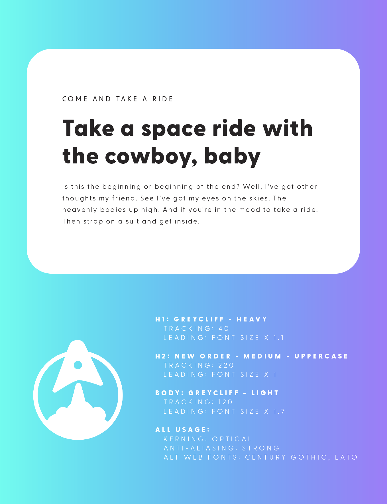
The identity system was inspired by space exploration, retro futurism, and NASA-era aerospace graphics. The goal was to create a brand world that feels expansive, imaginative, and optimistic while still grounded in strategy and clarity. I developed the full visual identity system, including logo design, typography, iconography, gradients, custom color naming, and various digital applications across the brand.
Brand Strategy
The Stellastra Effect positions strategy and storytelling as tools for growth, helping brands build visibility through strong content, distinctive visuals, and clear messaging. The identity frames this process through the metaphor of exploration, positioning creative work as a launch point for discovery, expansion, and transformation.
The brand is rooted in curiosity, originality, and intentional storytelling. Every element of the system was designed to balance creativity with professionalism, creating a world that feels immersive without sacrificing usability or clarity.
The identity was designed for founders, creatives, and modern lifestyle companies looking for a partner with both editorial expertise and strong visual direction.
(Old Logo)
Logo System
The logo system draws heavily from aerospace branding, mission patches, and vintage NASA graphics. The goal was to balance retro-futurist inspiration with modern digital design, creating an identity that feels thematic, recognizable, and scalable across platforms.
-
The primary wordmark uses bold geometric letterforms inspired by retro space-age typography systems. The result feels futuristic and expressive while remaining clean and highly functional across digital applications.
-
The custom symbol reinterprets the form of a rocket ship into a simplified graphic mark that feels iconic and adaptable. Designed for use across social media, merchandise, digital assets, and branded materials, the symbol reinforces themes of momentum, elevation, and creative exploration central to the brand identity.


(Full Logo)
Color Palette
The palette draws from deep space imagery, galactic atmospheres, vintage sci-fi visuals, and celestial gradients. Cosmic blues, ultraviolet tones, dark neutrals, and glowing accent colors work together to create a visual system that feels immersive and dimensional. Layered gradients and specialized color names inspired by astronomy and space exploration reinforce the narrative world of the brand, while black and deep navy tones create contrast and depth throughout the system. The palette was designed to create a sense of atmosphere, motion, and discovery while remaining flexible across digital applications.
Eclipse
Cosmic
Nebula
Black Hole
Interstellar
Milky Way


Typography
The typography system combines futuristic structure with editorial clarity. Inspired by aerospace graphics, mission control systems, and retro sci-fi typography, the font pairing uses bold geometric forms alongside clean supporting typefaces to create strong hierarchy and readability. The result feels immersive and thematic while remaining highly functional across web, social, and branded content.
Icons & Visual Language
The icon system expands the aerospace-inspired identity through custom graphics influenced by navigation systems, orbital diagrams, spacecraft controls, and mission patches. These elements help build a fully realized visual universe around the brand while supporting consistency across applications.
The broader visual language uses gradients, layered compositions, celestial textures, and graphic overlays to create depth and atmosphere throughout the system. Together, these elements reinforce the brand’s focus on exploration, storytelling, and creative momentum.


The Stellastra Effect transforms creative strategy into an immersive visual experience inspired by exploration, curiosity, and momentum. By combining aerospace-inspired design with editorial storytelling, the identity creates a brand world that feels imaginative, recognizable, and built for discovery.